Seurat v4.3 dotplot algorithm
The default scaling of the dotplot function from Seurat is easy to use but the default options can make the plot difficult to interpret. The full set of options is available in their website manual and described in more detail in their code.
Below I show the dotplots created with the different options, which look very different.
- Dotplot algorithm overview
- Version 1: Dotplot with z-scoring expression values
- Version 2: Dotplot without z-scoring expression values
- Which set of expression values to show
The Seurat dotplot function for visualizing single cell data outputs a ggplot object, but the data of this plot object can be accessed by extracting $data. The data has multiple fields including a column avg.exp and avg.exp.scaled. The code of the dotplot function is available on their github.
Dotplot algorithm overview
There are three major steps in the seurat dotplot algorithm.
- Counts are obtained. For the input seurat option and input assay (default is the active assay), values are extracted from data slot and exponentiated with expm1. The default normalization method used to create the data slot is that feature counts for each cell are divided by the total counts for that cell and multiplied by the scale.factor, … [then] natural-log transformed using log1p. In this case the exponentiation returns the read depth corrected counts to the slot
avg.exp. - Next these corrected counts are averaged across each grouping or dot in the dotplot.
- Lastly depending on if
scale=Trueorscale=Falsetheavg.expcolumn values are transformed to the default displayed values inavg.exp.scaled. The method is described in the last section on this page.
A very important point about step 1 above is that for each group, the counts are exponentiated prior to averaging. Therefore the Dotplot function does not take counts directly from the counts slot of the default Assay!
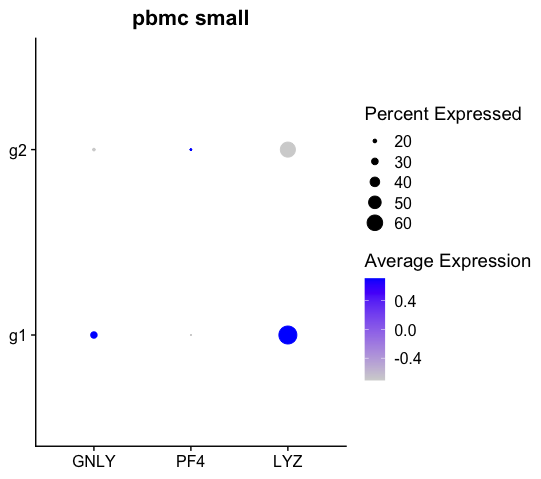
Version 1: Dotplot with z-scoring expression values
The default scaling of dotplot (scale=True) is to z-score the expression values. The calculation is done in the following code from their github:
avg.exp.scaled <- sapply(
    X = unique(x = data.plot$features.plot),
    FUN = function(x) {
      data.use <- data.plot[data.plot$features.plot == x, 'avg.exp']
      data.use <- scale(x = data.use)
      data.use <- MinMax(data = data.use, min = col.min, max = col.max)
      return(data.use)
    }
  )
However when visualized this can look a bit misleading. The reasons have been discussed previously in their github issues, for example:
- The scaled value used in the Dotplot function may, depending on the option, differ from vlnplot.
- When there is a two groups, the coloring between the groups will appear binarized which doesn’t necessarily affect true signal.
This is shown below with the sample human pbmc_small object which has an inbuilt metadata groups. We can see that with default options, since there are only 2 groups g1 and g2, their coloring represent opposite ends of the color scale.
library(Seurat)
packageVersion("Seurat")
#[1] ‘4.3.0.1’
pbmc_small # included by default in Seurat package.
# An object of class Seurat
# 230 features across 80 samples within 1 assay
# Active assay: RNA (230 features, 20 variable features)
#  3 layers present: counts, data, scale.data
#  2 dimensional reductions calculated: pca, tsne
head(pbmc_small[[]])
#                   orig.ident nCount_RNA nFeature_RNA RNA_snn_res.0.8 letter.idents
# ATGCCAGAACGACT SeuratProject         70           47               0             A
# CATGGCCTGTGCAT SeuratProject         85           52               0             A
# GAACCTGATGAACC SeuratProject         87           50               1             B
# TGACTGGATTCTCA SeuratProject        127           56               0             A
# AGTCAGACTGCACA SeuratProject        173           53               0             A
# TCTGATACACGTGT SeuratProject         70           48               0             A
#                groups RNA_snn_res.1
# ATGCCAGAACGACT     g2             0
# CATGGCCTGTGCAT     g1             0
# GAACCTGATGAACC     g2             0
# TGACTGGATTCTCA     g2             0
# AGTCAGACTGCACA     g2             0
# TCTGATACACGTGT     g1             0
dot <- Seurat::DotPlot(pbmc_small,
                       features=c("GNLY", "PF4", "LYZ"),
                       assay ="RNA",
                       scale=TRUE,
                       group.by = 'groups') +
  theme(plot.title = element_text(hjust = 0.5),
        axis.title.y = element_blank(),
        axis.title.x = element_blank())+
  ggtitle("pbmc small")
df <- dot$data
head(df)
#         avg.exp  pct.exp features.plot id avg.exp.scaled
# GNLY   73.39871 16.66667          GNLY g2     -0.7071068
# PF4    88.78884 13.88889           PF4 g2      0.7071068
# LYZ   346.89642 58.33333           LYZ g2     -0.7071068
# GNLY1 190.09855 29.54545          GNLY g1      0.7071068
# PF41   85.26050 11.36364           PF4 g1     -0.7071068
# LYZ1  426.48775 68.18182           LYZ g1      0.7071068
Note the Seurat Dotplot object created above shows the value in the column avg.exp.scaled by default as seen below:
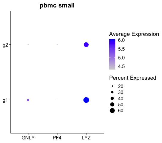
Version 2: Dotplot without z-scoring expression values
When running Dotplot function with scale=False, the expression shown is simply average expression per cell. The effect of doing the scaling will ONLY change the avg.exp.scaled values as seen in the following code:
dot <- Seurat::DotPlot(pbmc_small,
                       features=c("GNLY", "PF4", "LYZ"),
                       assay ="RNA",
                       scale=TRUE,
                       group.by = 'groups') +
  theme(plot.title = element_text(hjust = 0.5),
        axis.title.y = element_blank(),
        axis.title.x = element_blank())+
  ggtitle("pbmc small")
df <- dot$data
head(df)
#         avg.exp  pct.exp features.plot id avg.exp.scaled
# GNLY   73.39871 16.66667          GNLY g2       4.309439
# PF4    88.78884 13.88889           PF4 g2       4.497461
# LYZ   346.89642 58.33333           LYZ g2       5.851905
# GNLY1 190.09855 29.54545          GNLY g1       5.252789
# PF41   85.26050 11.36364           PF4 g1       4.457372
# LYZ1  426.48775 68.18182           LYZ g1       6.057926
This produces the modified plot:
Which set of expression values to show
There are two columns reflecting the expression values for the dotplot object when exported from the Seurat Dotplot function. By default avg.exp.scaled is shown, but how its values are calculated will change as seen above depending on how the scale option is set.
If scale=True the expression values are calculated from the data slot (becoming the avg.exp column) then min-maxed based on the col.mnin and ‘col.max` parameters.
If scale=False the expression values (i.e. the avg.exp column) are instead transformed by taking a log1p of the ‘avg.exp’ group.
The latter option may be more interpretable as the log normalized, read corrected counts.